Babygrow
Providing parents with weekly, easy to do at home activities, tailored to the child’s growth.
When the pandemic hit, parents all over the world needed a way to play with their child, while stimulating development.
With a rising lack of accessible childcare, Babygrow can help parents engage in meaningful play with their child and create joyful moments together.
Problem
Insufficient childcare facilities. No acess to childcare during the pandemic.
Delivered
Platform that provides parents and caregivers with weekly activities adapted to the child's growth.
Company
HYP Software
Role
Product Designer
Timeline
Jan 2020 - May 2020
Why?
Our colleagues, being recent parents, were confronted with the shortage of daycares facilities.
They’re often nor accessible or affordable to everyone, so more and more parents are leaving their kids with a trusted caregiver, whom might not have the knowledge or ability to create a thriving and safe environment for the kid’s growth.
💻
Lack of childcare instituitions
📋
Lack of knowledge of the caregiver
Design Process
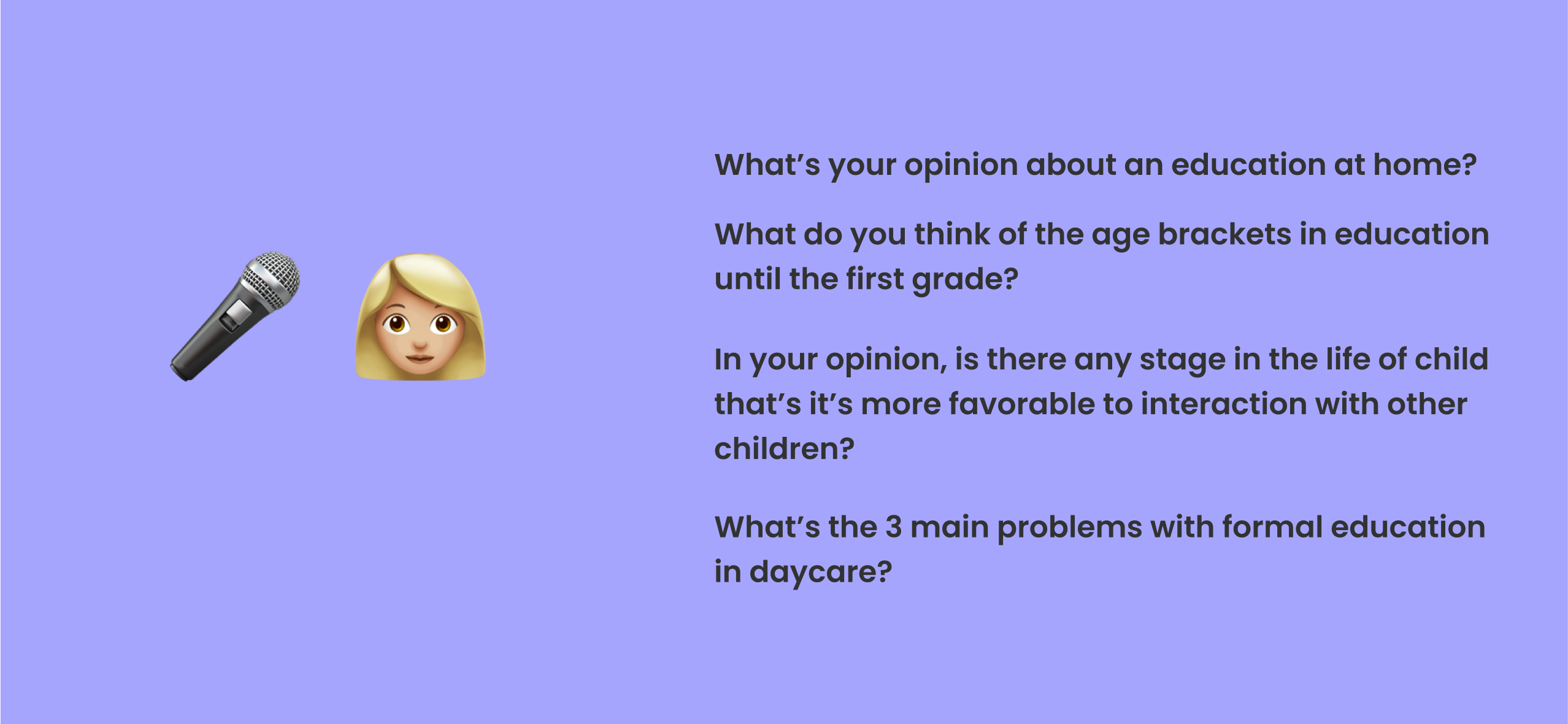
User Interviews
The first step was to interview both parents and child educators, so we could get some data about the problems that parents were facing at the moment, but also some input on how to build the app to better accomodate the children's development needs.
We learned about education methodologies like Montessori and Waldorf and tried to understand if our understand if our product idea was even valuable.
Competitive Analysis
We tested educational apps for a week and gathered that, in general, the activities were very goal-based. This was something that the educators warned us to stir away from, since it could cause a lot of stress on the child and caregiver.
The activities also required specific toys or a big time commitment. Our mission was now to find a way to make fun playtime activities, with things we can easily find at home, tailored for busy parents.

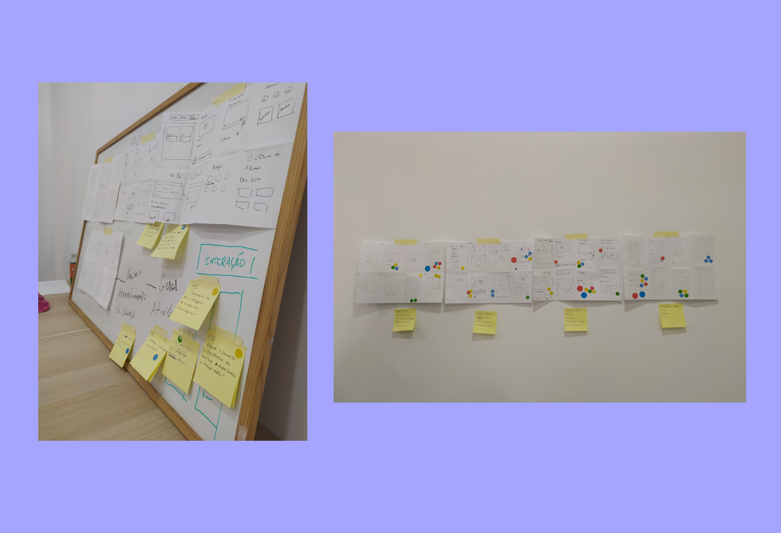
Design Sprint
Renewed with a new sence of purpose and to make a better use of the data we gathered, we decided to do a design sprint.
We built user journeys, how might we questions, finishing the sprint with a rough prototype and a bunch of constraints to keep in mind. We wanted to keep the aesthetic and patterns of similar apps, while innovating and creating something new.
1st Try - Testing & Improvements
Based on our design sprint sketches, we quickly produced wireframes so we could do user testing with child experts. This was when we started to iterate and understand the importance of some key features of the platform.
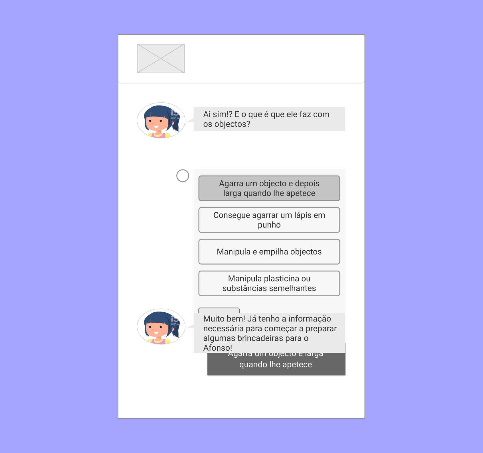
Got rid of the chatbot 🤖
This was a very important change and we aimed to keep the voice of the child as the center of attention. This feature humanized the overall experience, diminishing any disconnect between the child and the caregiver.
Before
Upon first testing, we noticed some resistance from the part of the users when it came to the chatbot.
After
After some discussion, we decided to transform the chatbot into a form, first-person with the child's voice.
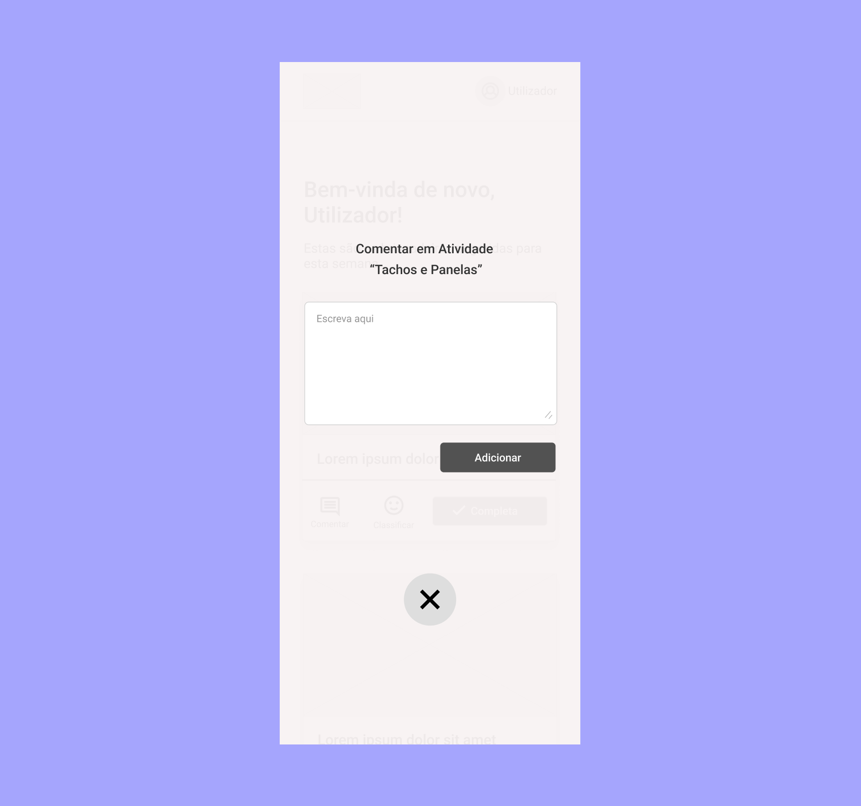
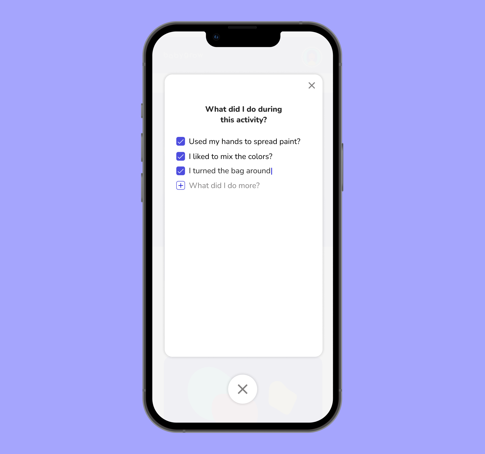
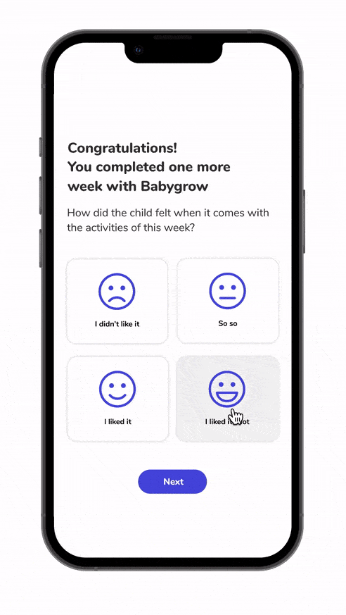
Changed the notes feature 💬
This change required the most effort, since we had to tailor a task list for every activity. The lists had to be very simple and non-biased, so that the caregiver wouldn't treat like a list of accomplishments.
This also allowed us to know if the activities were simple and comprehensive enough.
Before
When we tested the app with parents, we noticed this feature had little guidance on what to write.
After
We changed the feature from an open commentary to a check list, with pre-filled examples, so parents would be more compelled to annotate the child’s progress.
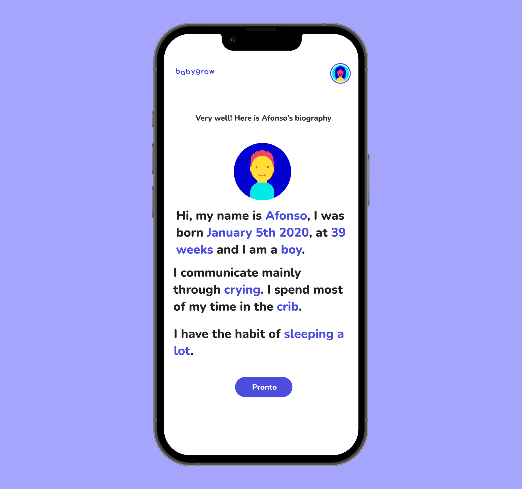
Improved app copy 📝
A lot of the improvements requests, were about the copy writing. When dealing with such sensitive topics, it's important to use clear, non-biased language so caregivers can communicate the child's emotions without treating it like a competition.

Before
The child experts we worked with were worried about the clarity of the rating system. It was unclear if this was about the child's mood or about the activity.
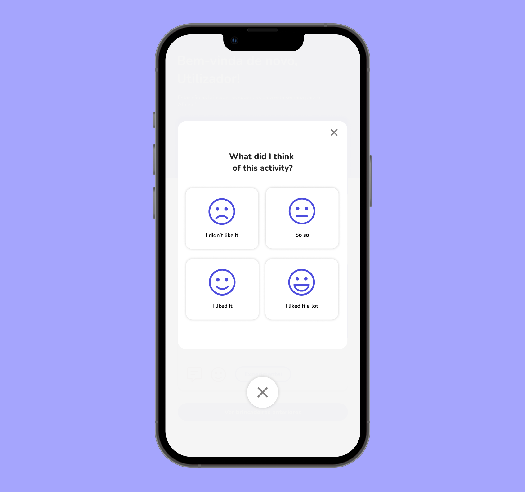
After
We improved the overall copy of the app, placing again the child in first place, leaving no room for biased language when dealing with a child's growth.
2nd Try - Design System & Final Solution
After multiple revisions and months of work, we were finally ready to launch the product. We were still in the midst of constant lock downs and we hope Babygrow helped parents in this time of need.
Design System
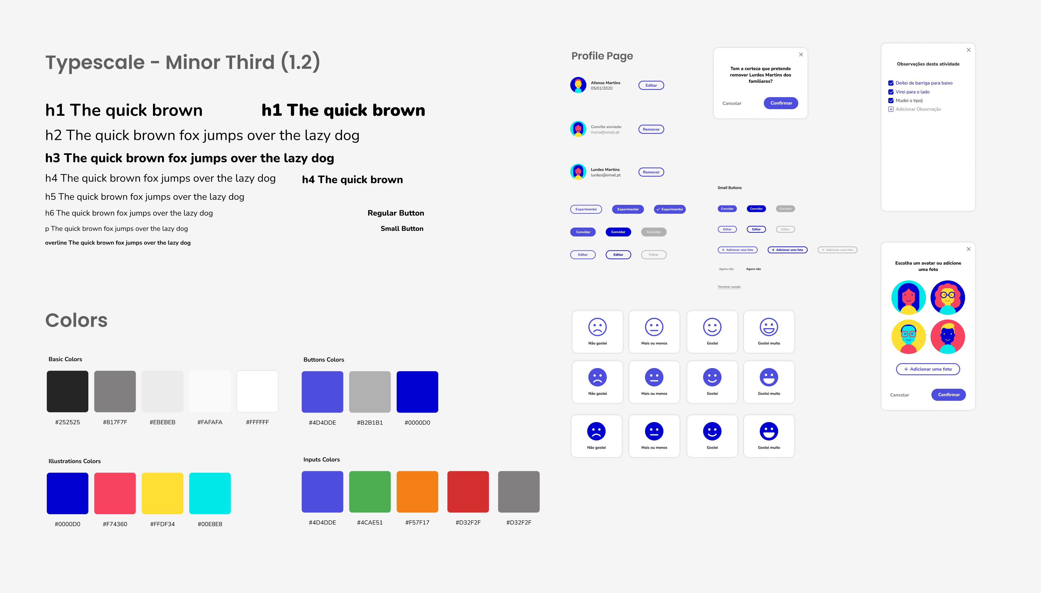
For the product to work as intended, the caregiver needs to fill quite a few amount of forms. To keep the forms as dynamic as possible but also consistent, we decided to invest on a design system.
Our design system features a modular font-scale, colors and components. It was also used as a base to make countless illustrations that we included on the app and also on the promotional materials.
Key Features
👶🏼📈
Adapts to the child growth
✦ Initial form to get a good grasp on the child learning process.
✦ Intuitive UI and non-biased language.
✦ Weekly acessment to adapt the activities to the child capabilities and needs.
✦ Easy to fill forms to keep the overall experience light and easy.
📅⚽
Weekly Activities
✦ New activities every week that are created by chilcare professionals.
✦ The activities provided are also safe and use everyday materials that everyone has at home.
✦ Reducing frustration. We will avoid suggest activities that the child didn't like.

If we had more time...
Of course there’s always things to improve.
Here are some of the features we would like to see implemented in the near future.
🧩
Feature that allows the user to create playgroups.
📆
Calendar view with events.
📊
Monthly recaps with statistics.
🖼️
Shareable photo gallery.
